How I Built a Real-Time Commute-Time Map for Chittagong Using Next.js, Mapbox & Turf.js
A step-by-step walkthrough of building an interactive isochrone map of Chittagong: click anywhere and see where you can drive in 10 to 60 minutes, with Mapbox's Isochrone API, Mapbox GL JS road colouring and Turf.js hover tooltips.
By Md Minaruzzaman Shovon · · Updated · 6 min read
Key takeaways
- The app shows every place reachable by car within 10–60 minutes from any point in Chittagong; clicking or dragging the pin recalculates instantly.
- Drive-time polygons come from the Mapbox Isochrone API, fetched client-side as two parallel requests because the API allows at most 4 contours per call.
- A GPU-evaluated Mapbox style expression colours bands from yellow (near) to navy (an hour away), and a Roads mode uses the `within` expression to paint travel time onto streets.
- Turf.js booleanPointInPolygon powers instant hover tooltips showing the road name and its drive time from the pin.
- There is no backend: it deploys statically, using a URL-restricted public Mapbox token.
On this page
- The Problem I Wanted to Solve
- Tech Stack at a Glance
- Step 1 — The Map Canvas
- Step 2 — Fetching Isochrones from Mapbox
- Step 3 — The Colour Ramp
- Step 4 — Roads Mode: Painting Travel Time onto Streets
- Step 5 — The Heatmap Toggle
- Step 6 — Live Hover Tooltips
- Step 7 — Click to Re-Pin the Origin
- Step 8 — Road Hierarchy Styling
- Architecture Decisions Worth Calling Out
- Challenges I Hit
- What's Next
- Final Thoughts
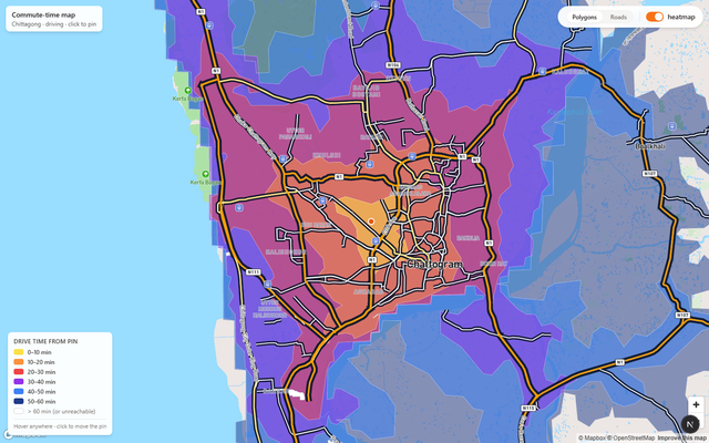
A step-by-step walkthrough of building an interactive isochrone map — click anywhere on the city, see exactly how far you can drive in 10, 20, 30, 40, 50, or 60 minutes.
TL;DR — I built a browser-based map that shows every place you can drive to from any point in Chittagong within 60 minutes. You click, it recalculates. Flip between a polygon heatmap mode and a road-coloring mode to see travel time painted directly onto streets.
The Problem I Wanted to Solve
Chittagong (officially Chattogram) is Bangladesh's second-largest city and its main port. It is notoriously difficult to navigate — winding hills, bottlenecked port roads, and rapidly expanding suburbs mean that two locations that look close on Google Maps can be a completely different story at 5 PM on a Tuesday.
I wanted a single-glance answer to the question: "If I live here, where can I actually reach in under half an hour?"
Every commute planner I found either required a destination or gave text-based estimates. None gave you a visual blob on a map you could move around interactively. So I built one.
Tech Stack at a Glance
| Layer | Choice | Why |
|---|---|---|
| Framework | Next.js 15 (App Router) | Server components + zero-config TypeScript |
| Map renderer | Mapbox GL JS v3 | WebGL tiles, layer API, Isochrone API |
| Geospatial math | Turf.js v7 | booleanPointInPolygon for hover tooltips |
| Language | TypeScript | Type-safe GeoJSON handling |
| Styling | Tailwind CSS | Rapid UI without fighting CSS specificity |
Step 1 — The Map Canvas
The first thing I did was wrap Mapbox GL JS in a React ref so the map lifecycle is cleanly separated from React state. The key detail is locking the map bounds to Chittagong's bounding box — all the API calls are tuned for this geography, so preventing the user from panning to Dhaka avoids confusion.
// components/CommuteMap.tsx (excerpt)
const mapRef      = useRef<mapboxgl.Map | null>(null);
const containerRef = useRef<HTMLDivElement | null>(null);

useEffect(() => {
  if (!containerRef.current || mapRef.current) return;
  mapboxgl.accessToken = TOKEN;
  const map = new mapboxgl.Map({
    container: containerRef.current,
    style: "mapbox://styles/mapbox/streets-v12",
    center: CTG_CENTER,    // [91.8123, 22.3475] — GEC Circle
    zoom: DEFAULT_ZOOM,    // 12
    minZoom: 11,
    maxZoom: 16,
    maxBounds: [           // lock view to Chittagong
      [CTG_BBOX[0] - 0.05, CTG_BBOX[1] - 0.05],
      [CTG_BBOX[2] + 0.05, CTG_BBOX[3] + 0.05],
    ],
  });
  mapRef.current = map;
}, []);
Step 2 — Fetching Isochrones from Mapbox
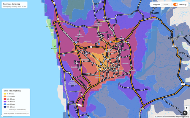
The Mapbox Isochrone API is the heart of the project. You send it a coordinate and a list of travel-time thresholds; it returns GeoJSON polygons — one polygon per threshold — covering every point reachable within that time by car.
I split the six bands into two parallel requests to stay under the API's 4-contour-per-request limit:
// lib/isochrone.ts
const ENDPOINT = "https://api.mapbox.com/isochrone/v1/mapbox/driving";

async function fetchBatch(lng, lat, minutes, token) {
  const url = `${ENDPOINT}/${lng},${lat}`
    + `?contours_minutes=${minutes.join(",")}`
    + `&polygons=true&denoise=1&access_token=${token}`;
  const res = await fetch(url);
  if (!res.ok) throw new Error(`Isochrone request failed: ${res.status}`);
  return res.json();
}

export async function fetchIsochrones(lng, lat, token) {
  const [a, b] = await Promise.all([
    fetchBatch(lng, lat, [10, 20, 30, 40], token),
    fetchBatch(lng, lat, [50, 60], token),
  ]);
  // Sort largest-first so nearer polygons paint on top
  const features = [...a.features, ...b.features]
    .sort((x, y) => (y.properties.contour ?? 0) - (x.properties.contour ?? 0));
  return { type: "FeatureCollection", features };
}
I also added an in-memory cache keyed on lng,lat rounded to 4 decimal places (~11 m precision). Dragging the pin slightly re-uses the previous fetch. Move 15+ metres and you get a fresh API call.
Step 3 — The Colour Ramp
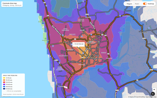
The visual language is a warm-to-cool gradient: yellow for "nearby", deep navy for "an hour away." This mirrors the inferno palette — psychologically, hot colours feel close and cool colours feel distant.
// lib/colors.ts
export const heatmapFillColor: any = [
  "interpolate", ["linear"], ["get", "contour"],
  10, "#fde047",   // yellow
  20, "#fb923c",   // orange
  30, "#ef4444",   // red
  40, "#9333ea",   // purple
  50, "#3b82f6",   // blue
  60, "#1e3a8a",   // deep navy
];
This is a Mapbox style expression — it runs on the GPU, interpolating colour continuously between the contour stops so adjacent bands blend smoothly rather than stepping abruptly.
Step 4 — Roads Mode: Painting Travel Time onto Streets
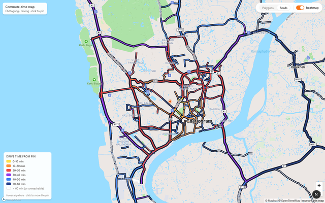
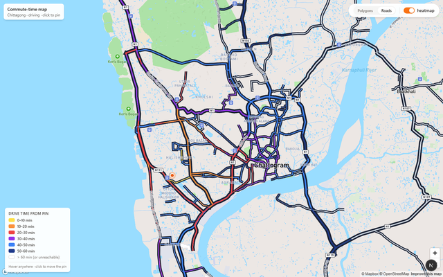
The polygon heatmap is great for an overview, but it obscures the actual road network. I wanted a second mode where the roads themselves are coloured by travel time.
The trick is Mapbox's within filter expression. For each road segment, I iterate through the isochrone polygons from smallest to largest and paint the road with the colour of the smallest band that contains it:
function buildRoadBandColor(fc: FeatureCollection<Polygon>): any {
  const bands = [...fc.features].sort(
    (a, b) => (a.properties?.contour ?? 0) - (b.properties?.contour ?? 0),
  );
  const expr: any[] = ["case"];
  for (const f of bands) {
    const c = f.properties?.contour ?? 60;
    expr.push(["within",
      { type: "Feature", properties: {}, geometry: f.geometry }
    ]);
    expr.push(colorForMin(c));
  }
  expr.push("#cbd5e1"); // grey fallback — unreachable / >60 min
  return expr;
}
Step 5 — The Heatmap Toggle
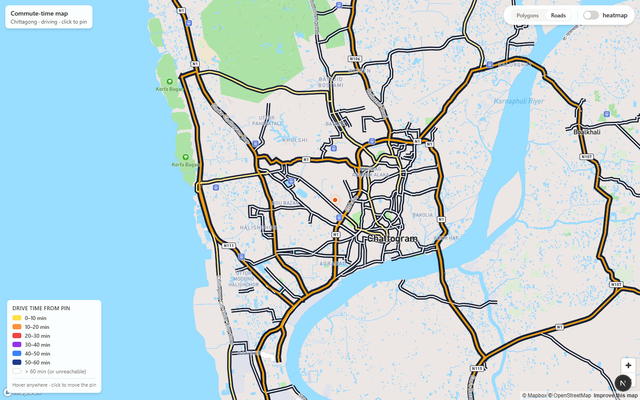
Sometimes you just want to see the base map — maybe to orient yourself before setting a new pin. The heatmap toggle is a single boolean state that shows or hides the GeoJSON fill and outline layers:
const [heatmap, setHeatmap] = useState(true);

const setVis = (id: string, v: boolean) =>
  map.getLayer(id) &&
  map.setLayoutProperty(id, "visibility", v ? "visible" : "none");

setVis(FILL_LAYER, heatmap && classifyBy === "polygons");
setVis(LINE_LAYER, heatmap && classifyBy === "polygons");
Step 6 — Live Hover Tooltips
A static heatmap is useful; an interactive one is genuinely fun. I used Turf.js's booleanPointInPolygon to find the smallest isochrone band containing the cursor, and simultaneously queried Mapbox for any rendered road under the cursor to show its name:
const updateHover = (e: mapboxgl.MapMouseEvent) => {
  const pt = turfPoint([e.lngLat.lng, e.lngLat.lat]);
  let best = Infinity;
  for (const f of fc.features) {
    const c = f.properties?.contour ?? Infinity;
    if (c >= best) continue;
    if (booleanPointInPolygon(pt, f)) best = c;
  }
  const hits = map.queryRenderedFeatures(e.point, { layers: roadLayers });
  const roadName = hits.find(h => h.properties?.name)?.properties?.name;
  const label = best === Infinity
    ? "more than 60 min away by car"
    : `≤ ${best} min from pin`;
  hoverPopup
    .setLngLat(e.lngLat)
    .setHTML(`<div>${roadName ? `<b>${roadName}</b><br/>` : ""}${label}</div>`)
    .addTo(map);
};
map.on("mousemove", updateHover);
Step 7 — Click to Re-Pin the Origin
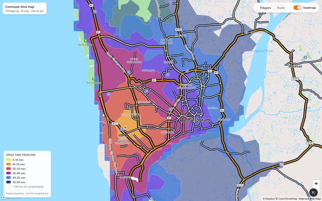
The entire point of the app is that you can drop the pin anywhere and immediately see the reachable zones from there. The map's click event updates React state; the state change triggers a debounced isochrone fetch:
map.on("click", (e) => setOrigin([e.lngLat.lng, e.lngLat.lat]));

useEffect(() => {
  debounceRef.current = setTimeout(async () => {
    const fc = await fetchIsochrones(origin[0], origin[1], TOKEN);
    const src = map.getSource(SRC_ID) as mapboxgl.GeoJSONSource;
    src.setData(fc);
  }, 300);
}, [origin]);
The marker is also draggable — click-and-drag the orange dot to a new position and isochrones update after you release.
Step 8 — Road Hierarchy Styling
One UX detail I spent a lot of time on: keeping the base map legible under the semi-transparent heatmap. Plain Mapbox Streets washed out under the orange fills. My fix was to give each road class a warm amber palette with strong dark casings, and to hide all minor streets, paths, and railways:
const fillColorFor = (cls: string) =>
  cls === "motorway" ? "#f59e0b" :   // amber
  cls === "trunk"    ? "#fbbf24" :
  cls === "primary"  ? "#fde68a" :
                       "#ffffff";

// Casings (outlines) use near-black for maximum contrast
map.setPaintProperty(casingLayerId, "line-color", "#0f172a");
Architecture Decisions Worth Calling Out
Why no backend?
All isochrone fetches happen client-side directly to the Mapbox API. No Node proxy. This means the app can be deployed statically on Vercel or Netlify with zero backend cost. Since Mapbox public tokens (prefixed pk.) enforce URL-based allowlists, exposing it in the browser is safe.
Why two parallel isochrone requests?
The Mapbox Isochrone API allows a maximum of 4 contour values per request. I need 6 bands. Two parallel Promise.all() fetches cut total latency nearly in half compared to two sequential calls.
Why sort polygons largest-to-smallest?
Mapbox paints GeoJSON features in source order. The 60-minute polygon covers the 10-minute area completely. If I added features smallest-first, the large outer polygon would paint over the inner ones. Sorting largest-first means smaller (nearer) polygons are always visible on top.
Challenges I Hit
withinexpression size — The road band color expression embeds full polygon geometries. For complex isochrones this can be hundreds of KB, causing a brief stutter when switching to Roads mode. A future fix: simplify polygons with Turf before embedding.- The Karnaphuli River — The Isochrone API correctly models driving routes, so waterfront areas that are geographically close but only reachable via distant bridges appear in high time bands. Correct — but it surprised me during testing.
- Tailwind inside raw DOM elements — The pulsing marker injects HTML into a vanilla DOM element (Mapbox's API requirement). Tailwind classes worked because the stylesheet was already loaded globally, but HMR-related purging occasionally wiped the styles. Fixed by adding inline styles as a fallback.
What's Next
- Cartogram warp mode — distort the map geometry so areas take up space proportional to travel time, not physical distance.
- Transit mode — switch between driving, walking, and cycling isochrones.
- Save & share — encode the pin coordinate in the URL hash so you can share a commute view with a link.
- Multi-origin comparison — drop two pins and see the intersection of their reachable zones — useful for finding a meeting point between two offices.
Final Thoughts
This project showed me that geospatial data is surprisingly approachable in the browser in 2025. Mapbox GL's GPU-accelerated rendering, its Isochrone API, and Turf.js for point-in-polygon queries gave me a genuinely useful interactive map in a few hundred lines of TypeScript.
The hardest part wasn't the mapping itself — it was the UX: deciding what to show by default, keeping the map readable under the heatmap, and making the hover tooltip feel instant. (It is instant — Turf's booleanPointInPolygon runs synchronously in microseconds on modern hardware.)
If you live in Chittagong, try it. Drop the pin on your home, look at the yellow blob — and reconsider that apartment listing that's "only 5 km away" from work.
Live demo: maps01.shovon.bd
Built with ❤️ and caffeine in Chittagong. Stack: Next.js 16 · Mapbox GL JS v3 · Turf.js v7 · TypeScript · Tailwind CSS. Screenshots captured automatically with Playwright.
Frequently asked questions
What is an isochrone map?
An isochrone map shades every area reachable from a starting point within a given travel time. This one shows 10, 20, 30, 40, 50 and 60-minute driving bands from any point you choose in Chittagong.
Which tools does the commute map use?
Next.js and TypeScript for the app, Mapbox GL JS v3 for rendering, the Mapbox Isochrone API for drive-time polygons, Turf.js v7 for point-in-polygon hover checks, and Tailwind CSS for styling.
Why does the app make two isochrone requests?
The Mapbox Isochrone API accepts at most 4 contour values per request and the map needs 6 bands, so it sends 10/20/30/40 and 50/60 in parallel with Promise.all, which roughly halves latency vs sequential calls.
Where can I try the Chittagong commute map?
The live demo is at maps01.shovon.bd.